Michigan Flyer Redesign
Streamlining a mobile-first experience for seamless airport commute services
Project Type:
UT 330 Interaction Design and Urban Experiences
Duration
2 Months
Role
UX Designer
UX Researcher
Team member
Odiso Obiora
Sibora Berisha
Urja Kaushik
SKILLS
User Interview
Usability Testing
Ideation
Wireframing
Prototyping
Journey Mapping
Interaction Design
tools
Figma
Miro
Google Form

OVERVIEW
Michigan Flyer is a shuttle service connecting Ann Arbor, East Lansing, and Detroit Metro Airport. While many travelers rely on its mobile site to check schedules, purchase tickets, and plan trips, the current interface can feel cluttered and hard to use on the go.
“
How might we ...
improve the airport transit booking experience?
✅ Improving the mobile experience could increase ridership, enhance overall service quality, and ultimately support Ann Arbor’s 2030 carbon neutrality goals.
RESEARCH: SURVEYING
To understand user experiences with the Michigan Flyer, we collected 30+ digital surveys and placed an interactive board at the bus station. This helped us identify the primary users of the website and how they currently navigate and interact with it.
“It’s not good but it gets the job done.”
❗️ ️Acceptable, because I barely use it.
Most people find the current interface acceptable but note its inconvenience since it is an interface they only need to interact with once in a while.

*While most of our respondents were University of Michigan students due to our location, we recognize that the service also serves other commuters traveling between Ann Arbor and East Lansing, as well as daily travelers.
Research: Interviewing
There’s a preference for a mobile interface for on-the-go or public situations.
Key features exist but aren’t clearly surfaced to users: modifying reservation and bus tracking.
The site lacks persistence; user info isn’t saved, forcing repeated data entry.
Key information needed for decision-making isn’t easily visible to users (eg. absence of status updates, occupancy information, detailed pickup stop location).
Using these insights, we created a user journey map to highlight pain points and opportunities.

Background
The findings above led us to narrow down our problem statement.
“
Pain Points to Opportunities
🔍 By evaluating the current website, we identified these key pain points to translated into opportunities for improvement!
1
Limited Awareness of secondary tasks:
Modifying reservation and bus tracking
2
Repetitive User Input:
Including user information and terminal information in booking process
3
Absence of Decision-making Details Leading to Cognitive Overload:
Lacking occupancy Information, trip overview, and tailored recommendations
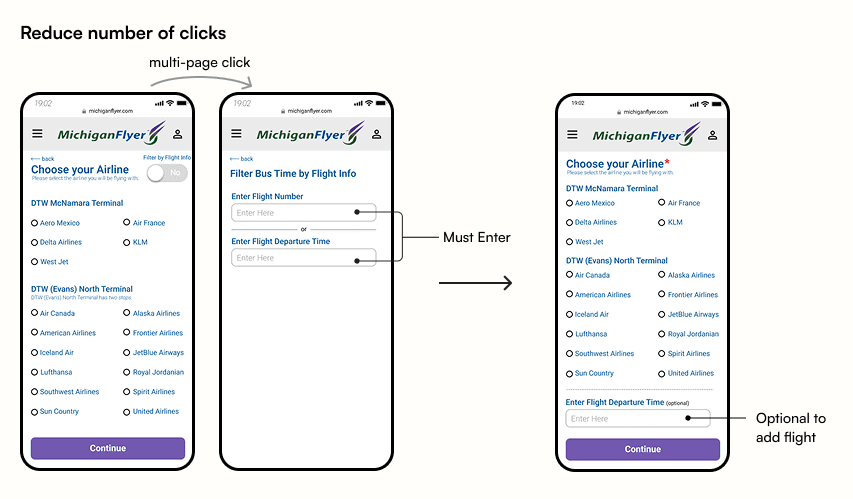
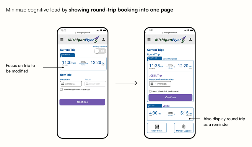
Design Process
✏️ The design process begins...
We started with low fidelity prototypes before transitioning into higher fidelity for user testing. In total, we conducted 8 usability testing to evaluate our design.
⭐ ️Key Lesson: less is more... we did a lot of reduction of pages, of information on pages.


Final Design
Booking Reservation
Modify Reservation
Bus Tracking
Reflection and Takeaway
This project holds a special place for me because it was my first full end-to-end design experience. I grew significantly as a designer, experimenting with typography, color, spacing, and visual hierarchy. I especially loved the research process. Conducting field research and setting up the interactive board at the bus stop pushed me to step outside my comfort zone and gave me the confidence to conduct more in-person research in the future.
This project was selected to represent our class in the annual Taubman College Student Showcase.
I also had the opportunity to present our findings to TheRide, the organization behind the Michigan Flyer. While I hope some of these improvements will be implemented, I also gained a deeper understanding of the real-world constraints local organizations face, especially in web development and service operations.
Next Steps
1
Include information on things to do at the airport or in each city the Michigan Flyer serves to enhance the user’s overall journey.
2
Provide details on how the Michigan Flyer connects to regional transportation, such as The Ride (Ann Arbor) or D2A2 (Detroit).
What I would've done differently
1
Reduce colors: The current interface uses many blues and purples. Looking back, I could have been more intentional with color, using color symbolically.
2
Simplify wording: Using clear, concise language helps users understand actions and information quickly, further reducing cognitive load.