Brooklyn’s Subway Ridership Visualization
A data visualization exploring how subway fare data reflects affordability within the MTA system through the use of reduced-fare tickets
Project Type:
UT 402 Creative Coding
Date
Winter 2025
Role
Frontend Developer/ Interaction Designer
Team member
Odiso Obiora
tools
VSCode
JavaScript
D3,js
NYC Open Data
SKILLS
JavaScript
D3,js
Data Manipulation
Data Visualization
Overview
Background
Growing up as a native New Yorker, the subway has always been a vital part of my routine.
With over 3.6 million daily MTA riders, understanding who these riders are and how they use the system can reveal important insights for improving service operations and accessibility.
This project began with a simple question:
Can a rider’s ticket type tell us more about their experience and accessibility within the subway system?
From this question, we developed a data visualization that maps and compares different subway fare types across Brooklyn’s districts, uncovering patterns that may point to disparities or opportunities in how Brooklynites move through their city.
“
How might we ...
use subway fare data to uncover patterns of affordability across Brooklyn’s districts?
Discovery
Data Sourcing
👀 I started exploring what kind of data the MTA makes public. It turns out, big cities like NYC have tons of open-source data available — so to build this visualization, I combined three different datasets.

Narrowing the Scope
Given the millions of daily NYC subway riders, running our algorithm on yearly ridership data across all boroughs would have exceeded our system’s capacity, as our MacBook Airs couldn’t handle that scale of computation. Therefore, we narrowed our focus to a subset of the data: Brooklyn’s ridership in October 2024.
❗️ Analyzing Brooklyn’s October 2024 ridership data provided a manageable starting point for uncovering broader NYC transit trends
You might wonder why we chose Brooklyn, October 2024. October has the highest ridership and fewer holidays, providing a more consistent dataset. Additionally, as a native Brooklynite, I’m personally interested in understanding my borough. That said, focusing on this subset does introduce bias. Brooklyn doesn’t represent all of New York City, and October isn’t reflective of year-round trends.
Data Cleaning
I simplified and consolidated categories to make the dataset easy to parse. For example, I ignored the distinction between OMNY and MTA tickets, as it didn’t provide useful insights for this analysis. Similarly, I grouped 7-day and 30-day unlimited tickets together under a single “unlimited” category to reduce complexity and focus on the most relevant patterns.

I generalized the fare category into 5 categories:
- student
- fair
- unlimited
- full
- senior
Process
How did we do it?

Design
Readability
To enhance the visibility of the dashboard, I've:
1
Displayed percentages instead of raw counts: Makes comparisons easier and more intuitive for the viewer
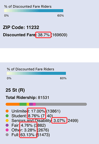
2
Highlighted selections on hover: Guides user attention and improves interactivity, helping users explore the data
3
Used color to emphasize Brooklyn as the primary focus: Directs focus to the key dataset, making the main story immediately clear
Features
Final
Reflection and Takeaway
Conclusion
As my final official UT project, this felt like a full-circle moment. Growing up in NYC and riding the subway inspired me to pursue Urban Technology at the University of Michigan, and for this project, I wanted to explore the very subject that sparked this 3.5-year journey.
Looking at the data visualization, we can observe a gradual gradient from North Brooklyn to South Brooklyn, with more discounted fare riders concentrated in the southern areas. While we can’t make definitive assumptions about residents’ demographics, the data suggests that lower-income or family-oriented populations, reflected in student and senior tickets, may be more prevalent in southern Brooklyn. To confirm these patterns, further analysis incorporating detailed income data by zip code would be necessary.
Next Steps
1
Expand: Since my laptop couldn’t handle large datasets, I focused on Brooklyn data from October 2024. In the future, I want to expand the visualization to include all five boroughs and subway lines to compare yearly trends across NYC neighborhoods.
2
Filter: To provide a cleaner visualization, I plan to add filters for year, ZIP code, and station.
3
Compare: Compare discount fare data with demographic and income data to uncover broader patterns and insights